 This is the very start of my animation. I posted this picture because the video would not upload. I really liked doing this project and I think it turned out really well
Monday, June 14, 2010
Animation
This is the very start of my animation. I posted this picture because the video would not upload. I really liked doing this project and I think it turned out really well
Friday, June 11, 2010
Corporate Logo
 For this project we had to make three corporate logos. This was my favorite of the three. I liked the the stroke on the words.
Animation Character
 This was my favorite project we did all year. I really liked how my character turned out. Also the background worked well.
Ipod Silhouette
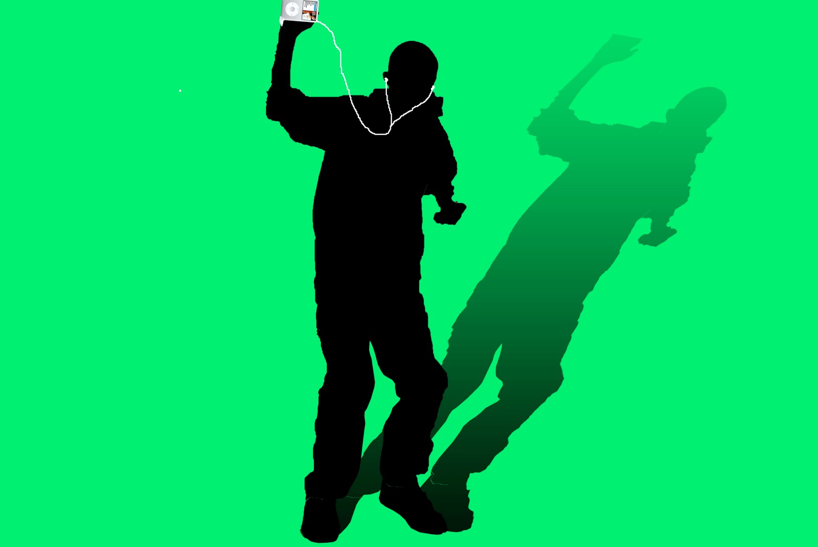 This project didn't turn out as good as I hoped it would. I didn't have very much time to work on it since I was absent when we started this project. I do like the shadow though
Website
 This was one of the first projects we did. This is only the home page for my website. I liked the symbol I made for this fake company.
Traced Car
 I really didn't like doing this project very much. But I did like how the car turned out. The background was done for extra credit.
Thursday, June 10, 2010
Teen Magazine
 For this assignment we had to make teen magazine. I really liked the pictures that I put in this. Also the stroke really helps you read the text.
Tabloid
 This was an extra credit project to make a tabloid. I liked how I edited superman and Donald Trump. Also the stroke on the picture of Donald Trump looks really good.
Annual Day Poster
 This was my annual day poster. I don't like all of the colors on this poster. I do like the person holding the book.
2nd T-Shirt Design
 This was the 2nd t-shirt design I made. This one was much easier since it was not a real picture it original was an animated picture with only a couple of colors. This one also come out cleaner than the first one.
T-Shirt Design
 This was an image that was edited to be black and white and made to be able to be printed onto a t-shirt. It messed up a little on the bat. Overall I was proud the way this turned out
Lip Dub Video Poster
 This was made for the 1990's portion of the lip dub video. I liked how there was only a couple of main colors. Also I liked how the title was smudged.
Subscribe to:
Posts (Atom)